During the period of Fall 2022 to Spring 2023, one of the academic commitments I had was the two trimester long student game project at DigiPen Singapore, affectionately given the module code GAM300 and GAM350. Perhaps the actual project may be written about more in a future post, but for now this post is focused on the process of making a specific feature in that project.
As a graphics programmer on our project, my responsibilities involved implementing visual features from our designers whom were part of the Bachelor of Arts in User Experience and Game Design program. This post details the development process from start to finish of one such feature that I was tasked to complete which was a ‘minimap’ that updates in real time as I analyzed the specifications given by the designers and solved problems on my own. My own degree is the SIT Joint degree of Computer Science in Real-Time Interactive Simulation so there were some challenges bridging the gap of expectations and experience.
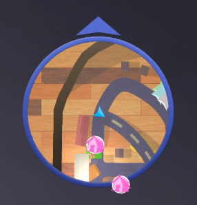
Screenshot of the final minimap itself below.
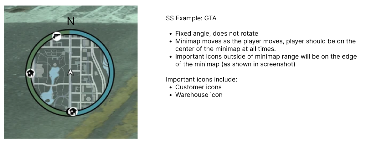
The first thing I had to work on was reading the specifications provided by the designer, breaking them down and understanding how to implement what was asked. The following is a screenshot of the initial specification informally sent to me by the designer during development.
As seen in the specifications, one of the main requirements is that it is updated in real time and that the center of the map is always correlated with the position of the player’s vehicle. There was also the additional requirement of icons that were clamped to the radius of the circular mini map.
The first problem I had to solve was the very concept of the moving map itself and in the moment I considered two possible approaches.
One approach would be to render icons on its own canvas in a separate framebuffer (we think of it like a separate screen the player can’t see) with a drawn map background, and we can use a Scissor Test to display only the relevant portions on the main gameplay screen. One way to visualize this in layman’s term is to imagine that there is a ‘screen’ underneath the gameplay screen which represents the entire drawn map, the minimap region as a ‘hole’ that looks onto that screen. When we move around with our vehicle, the bottom screen ‘shifts’ underneath the main screen so that the player’s icon is always in the center.
The gif below shows my crude impression of how to visualize this method, although since I have yet to implement it myself this is more speculation. The act of ‘dragging the bottom’ is also more metaphorical than literal, as we likely would be adjusting the uv range on the shader level for the texture instead. Still, the visual metaphor is a decent way to approach understanding the ‘Scissor Test’ method.
While this approach would be both more optimized and allow a degree of aesthetic design, and has been used in many video games such as the Grand Theft Auto series, we chose not to use it. The main reason we avoided it, ironically, was because of its primary strength: the ability to use artist created maps. During this point in development, we were still refining the main gameplay map and had to focus our resources as a team to more urgent features and, as such, there would be no one available to create multiple revisions of a drawn map for the minimap.
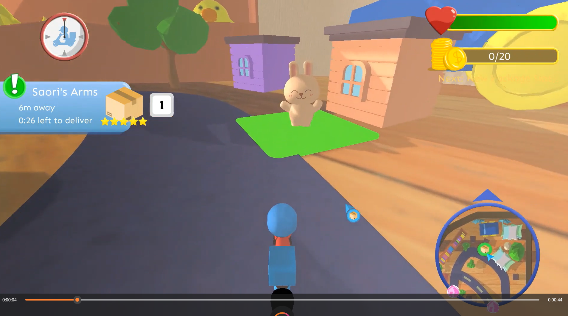
What if there was a way to not only ‘automatically update’ the actual map design when there are changes but also have that same minimap automatically compatible with any 3D environment you load the vehicle in? This is where the strength of the second approach comes in. In the video game, we draw the scene from a perspective view behind the vehicle, similar to pointing a camera at that motorcycle. This is shown in the screenshot below.
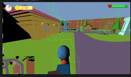
What if we could create a second camera that points at the motorcycle from above instead? This is the basis and simplicity of the second approach. I had already experimented with allowing the engine to display multiple perspectives of the scene from different cameras already and hence this approach was very viable for my initial prototyping. The screenshot below is an example of how the multiple cameras allows two different perspectives into the same scene.
So, could we simply point a camera on the top and call it a day? Surely there’s a catch, right? Yes, there are a few that must be considered and the most glaring of them is that we are effectively drawing the entire game’s scene twice. This is a huge waste of resources, as the minimap only needs to show a small portion of the game’s world to the user at a time. The following screenshot shows the minimap feature at this stage of development.
In this paragraph, I would be describing how I was able to use the technique of frustum culling in order to optimize the performance of this technique and how I did not have to use occlusion culling as our game’s environment did not have any interiors. I would display graphs of the improved merits of the optimization versus the naïve approach.
The above paragraph does not describe that. This is because I did not implement those optimization techniques due to a pleasant surprise while prototyping: the profiling of the naïve implementation of the camera-based minimap, the feature was still fast enough without the optimization to reach the target performance needed for the project. As such, I did not prioritize implementing the optimization techniques involving culling over my other responsibilities. The game’s scene simply happened to have a relatively low triangle count for the target hardware at this stage of development and that remained true until the completion of the project.
If I wanted to be credible to myself, this could be said to be a great example of avoiding premature optimization through the use of profiling tools at incremental stage of development, in order to create educated estimates of necessary workload for the demands of a project based off actual performance merits rather than speculation and guessing. Personally, I think I just got very lucky.
The framebuffer’s camera content was drawn onto as a texture onto a square in the corner of the screen. The settings could be adjusted at runtime, including the projection of the scene. While perspective projection adds a sense of depth similar to the human eye, for the purposes of a map we drew the scene with an orthographic projection instead, as we were concern with visual clarity and keeping the size of the rendered object consistent despite the ‘height’ of the camera.
The feature was not done yet. The minimap had to be circular but it its current state it was a rectangle. I came up with a method to ‘trim’ the map on the fragment shader. For those unfamiliar with the term fragment shader, a simplified explanation is that its code that runs on the graphics card which controls which fragments gets drawn onto the screen (in this instance, it is safe to think of the fragments to represent the pixels).
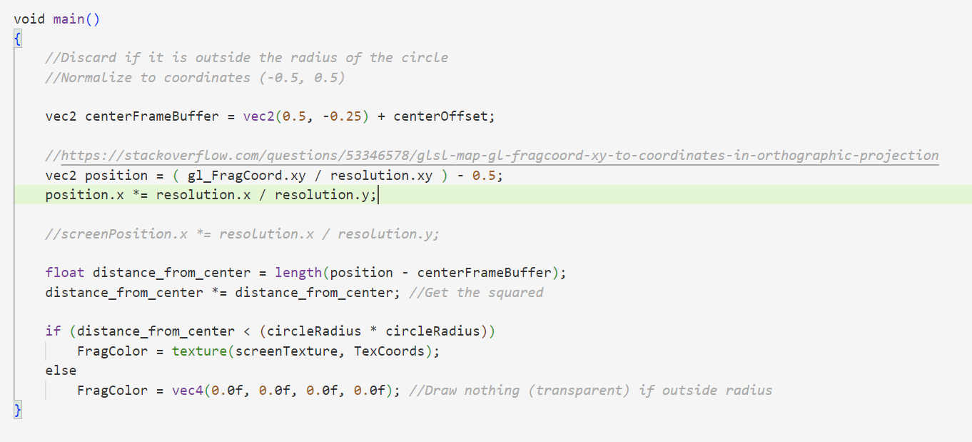
The above diagram was drawn to demonstrate what the fragment shader trimming logic was visually. In short, I set everything outside a circular radius to simply be completely transparent. It was relatively simple to concept and implement, although I also had to work out some complications over obtaining the actual ‘center’ of the texture. The code snippet below shows this.
As stated in the comments, the link referenced was a post that taught another user how to convert the ‘fragment coordinates’ to screen space. In order words, if the bottom left origin of the minimap was (0,0) relative the minimap, it would be a different value in the coordinate system of the entire window. Transformation between coordinate systems is something I am familiar with but at that moment when scripting this shader near midnight I needed a refresher and so still credited the source respectfully.
I confess, I don’t know remember the magic number of ‘-0.25’ at the time worked to solve a bug I had where the shape of the circle wasn’t uniform enough. I originally started with the more reasonable value of (-0.5, 0.5) to represent the center of the square, with the origin at the top left, and slowly tweaked values during prototyping until it looked correct.
Now that I am typing this in a retrospective, it might be because I made the assumption that I was working with a square instead of a rectangle, and hence failed to account for that ratio of width to height differently. In the future it would be wise to comment the process that drove me to use placeholder magic numbers, even if I was the only person working on that script at that point of time.
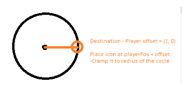
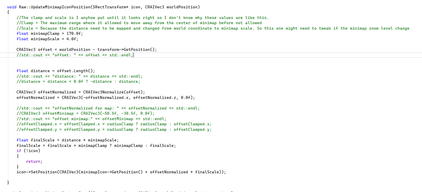
The above screenshot was of some of the notes I took for myself on prototyping the icon placement feature. Another aspect to consider not written in the notes was I had to transform the coordinate of the objects, such as the warehouse and collection points, from world coordinates to something more ‘local’ to the minimap.
The problem was further simplified as we only need to consider vectors relative to the player, which we already determined to always be in the center of the map. We also transformed the coordinate axis as the minimap has the horizontal be determined by the x-axis and the vertical determined by the y-axis, when the world coordinate counterpart would have it on the plane of the x and z axis.
The minimap’s center icon was also set to rotate relative to the the player’s rotation. During development, the rotation of the minimap center player icon was added in the scripting by a different team member.
Throughout development, feedback was given by team members on additional tweaks and quirks the feature needed and those were implemented over time. I also wrote my original code in such a way that some requirements could be worked on by other team members that were not me too, which is good.





Comments powered by Disqus.